•
Drizz raises $2.7M in seed funding •
•
Featured on Forbes
•
Drizz raises $2.7M in seed funding •
•
Featured on Forbes


Every mobile QA team ends up with two kinds of metrics dashboard. One tracks generic testing metrics defect density, escape rate, MTTD that any engineering team uses.
The other tracks metrics that only make sense on mobile: what fraction of DAU device matrix is covered, how much you're spending on real device hours per release, and what OEM-skin coverage gap looks like against a Samsung- or Xiaomi-heavy user base.
The generic ones are well-covered in software testing metrics for QA leads. This piece is about second dashboard mobile-only KPIs that require a device matrix, an OS-version matrix, and locale coverage to even compute.
The rest of this article names mobile-only KPIs, shows how to baseline them, and maps each to audience that actually asks about it.
Mobile-specific testing KPIs are measurements that a mobile QA team produces which don't exist for a backend, web, or desktop team. They fall into four groups:
Generic metrics like defectdefect density, MTTD, test coverage, and flake rate still apply to mobile teams. They're covered on their own pages. This article stays out of that territory.
Three things change when the surface is mobile.
The mobile dashboard reports on those three axes explicitly. The generic dashboard averages them out.
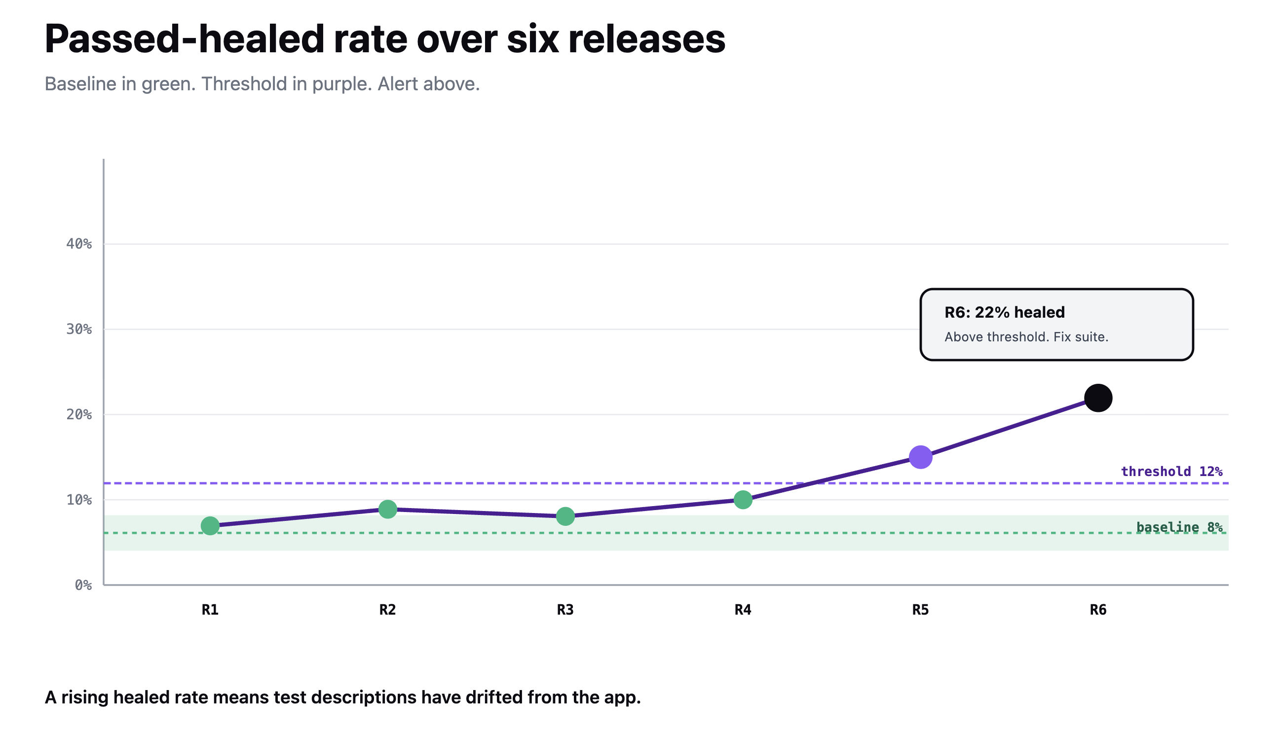
Six metrics belong on the QA lead's weekly review. Each requires a device-device matrix from the strategy article to compute.
The healed-rate KPI is uniquely observable on Drizz traditional Appium/Espresso suites don't distinguish between a real pass and a repaired pass. Teams that don't measure this can't tell whether their suite is holding up on its own or being propped up by self-healing.
The VP of Eng dashboard is a strict subset 3 to 4 numbers, not full weekly list.
Presenting 12 metrics to a VP dilutes signal. The right dashboard fits on a Slack thread. Everything else stays on QA lead's tab.
A metric without a baseline is just a number. Three steps establish baseline that turns number into a signal.
For metrics tied to matrix coverage, baseline also has to be re-anchored whenever device matrix changes a new market launch or an OS version deprecation resets denominator. See device tier and release stage matrix for maintenance triggers.
Not every metric earns a release-gate role. Four do.
Everything else is trend data, not gate data. Gating on too many metrics turns gate into noise and team routes around it.
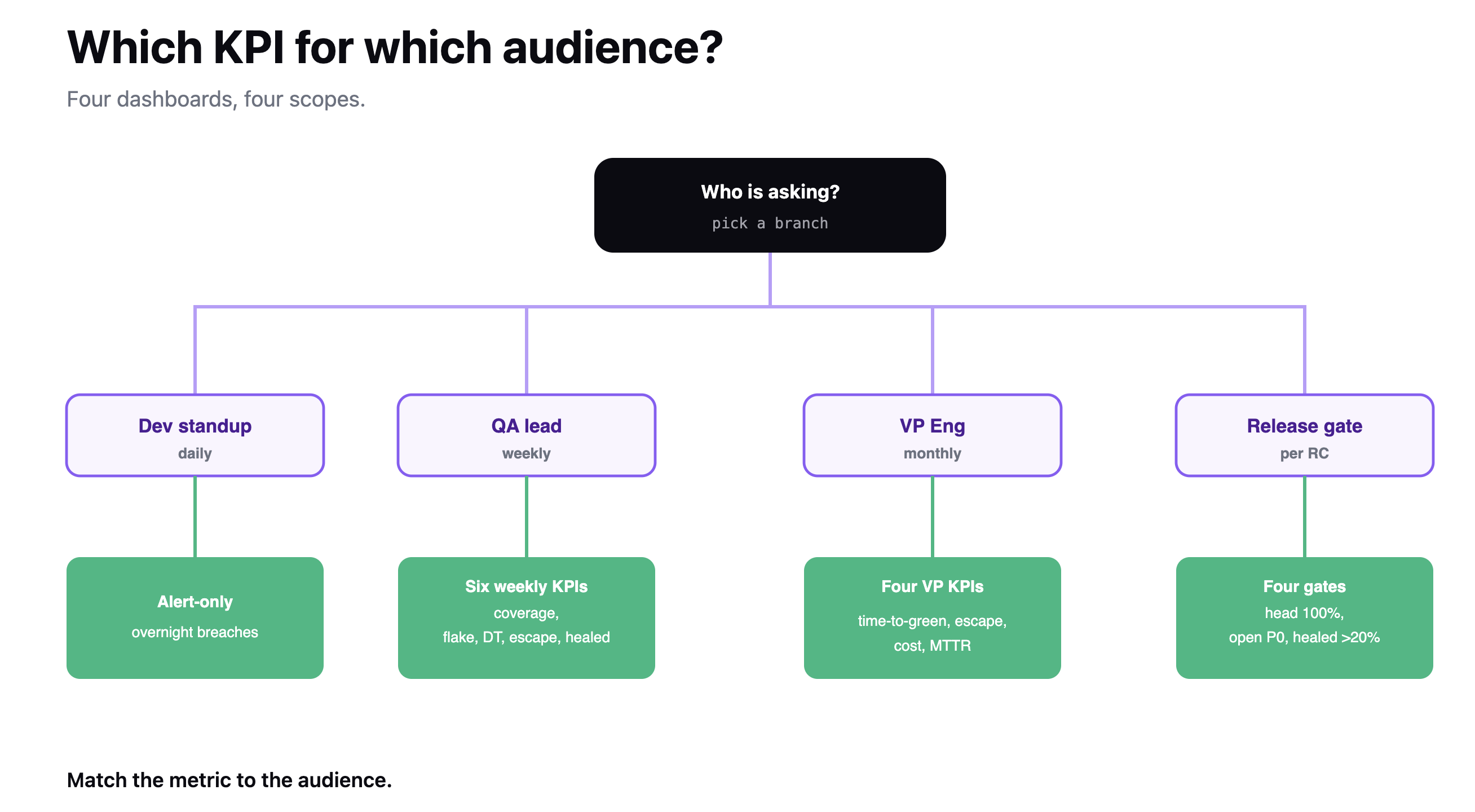
Three cadences, three audiences.
Any mobile-specific P0 that reaches production triggers an out-of-band review of metrics that should have caught it, before postmortem.
The metrics dashboard is a document, not a config file. Review its composition quarterly. A metric that hasn't crossed a threshold in a year is either wrong or unnecessary.
Mobile-specific testing KPIs cover coverage, cost, compatibility, and recovery dimensions that only exist because mobile has a device matrix, an OS-version matrix, and locale coverage.
Six metrics belong on QA lead's weekly review: head-tier coverage %, risk-tier coverage %, flake rate delta per tier, real-device-hour spend, compatibility escape rate, and passed-healed rate. Four belong on VP of Engineering dashboard: time-to-green on RC, mobile-specific escape rate, cost per release, and MTTR for mobile P0s.
Baselining takes 4–6 releases, uses median rather than mean, and sets degradation alert at 1.5× baseline. Four metrics are release gates; everything else is trend data.
Review cadence is daily / weekly / monthly, with three different audiences. Composition of dashboard itself gets reviewed quarterly. Generic testing metrics defect density, MTTD, escape rate belong on standard QA dashboard, not this one.

Head-tier and risk-tier device coverage %, OEM-skin coverage gap, per-OS-version coverage delta, real-device-hour spend per release, DT cost per flow per device, compatibility escape rate broken out by skin, and passed-healed rate. These all require a defined device matrix as denominator, so a testing-metrics dashboard designed for backend or web teams cannot compute them.
Pull top device × OS combinations from your DAU distribution Firebase Analytics, Mixpanel, or your own event stream and set that as denominator. The numerator is subset of those combinations suite actually ran against in review window.
For head tier (top 80% of DAU), target 100%; for risk tier (15%), target 60–80%. Recompute denominator whenever market or supported OS list changes.
Passed-healed rate is percentage of test runs finishing as Passed (healed) rather than plain Passed a Drizz-specific status that indicates run recovered from at least one failed step through self-healing. A rising rate signals that test descriptions have drifted from app's UI. Appium and Espresso suites can't observe this they either pass or fail; middle state is invisible.
Four: head-tier device coverage below 100% (no RC ships with head devices missing), unresolved compatibility escape from previous release (P0 on an OEM/OS still open), passed-healed rate above 20% on any single suite, and real-device-hour spend forecast exceeding budget. Everything else is trend data. Adding more gates than four turns gate into noise team routes around.





©Drizz 2026 • All Rights Reserved